Before starting this section, make sure you’ve completed all tasks in the Preparation page.
Lesson 1: Intro to GIS
In this first lesson, you will get a quick introduction to the QGIS interface. QGIS is the world’s most popular open source GIS software. It is incredibly powerful and can do all sorts of interesting visualizations and analyses. The primary challenge with this much functionality is that you have to learn what the buttons do and understand the terminology. We’ll work on that here. As your output, you’ll create a map of the McMaster University area.
Task 0: Download your data (if you have not already)
Complete this if not already done as part of the Preparation step. In this exercise, we’ll learn how to use QGIS by using data that is available from the City of Hamilton Open Data Portal. The open data portal has a wide variety of numeric and geospatial data sets that are free and open to use. Many cities and regions now have similar kinds of open data portals, so be sure to check if you’re ever doing analyses on your local area!
To download the data:
- Download
hamilton-data.zipfrom the workshop GitHub repository by clicking this link to download it directly (bit.ly/shad-ham-data). - Download the data into the directory that you want to use for this workshop (i.e. know where you saved the file and use a folder where you can read/write data)
- UNZIP THE FILE. This is very important–otherwise, weird things are going to happen for you.
Task 1: Learn the interface; Add and explore data
Objective: Explore the user interface
- On your computer, open QGIS Desktop.
- Follow along with Jay’s introduction to the important buttons and panels of the QGIS interface.
- Go to
Project>Propertiesand set your project Coordinate Reference System (CRS) toNAD83 / UTM zone 17N [EPSG:26917].- Check the box to “Enable on-the-fly CRS transformation”
- Find your downloaded and unzipped data using the Browser panel.
- Add a number of vector layers from the downloaded City of Hamilton data by dragging the shapefile (.shp) into the data frame (large window). Be sure to include at least the
Street_Centreline,Buildings, andEducational_Institutionslayers. Add some more! - Explore the attribute tables of these layers (Right-click on a layer in the Layers panel and select
Open attribute table. - Save your project: >Project>Save As… [this saves a project file with an extension .qgs]. Give your project file a meaningful name.
- Note that project files do not resave your layers–it simply preserves the links to the loaded layers, as well as any custom layer styling you’ve used.
Task 2: Style vector layers
Objective: Style your vector layers to create a map of a neighbourhood or area of Hamilton.
- Add/remove layers from the Open Hamilton Data folder as necessary or desired. Keep
Street_CentrelineandBuildings, and be sure to add all other relevant layers. - Move layers up and down in the Layers panel, note how it affects the drawing order.
- Style the layers by navigating to the Style tab of the Properties dialogue box (double click the layer or right-click and select
Properties). - Follow Jay’s instructions on styling vector layers. Then, experiment on your own.
- See this YouTube video and some other videos by Klas Karlsson for ideas on custom vector styling.
Task 3: Add labels to layers
- Select the
Street_Centrelinelayer and click on the Layer Labeling Options button .
. - In the top dropdown menu, select
Single Labels - In the
Valuedropdown menu, select theSTREET_NAMfield. Click Apply. - Explore the tabs for labelling options
- In the Text tab, adjust the font type, size, colour (if desired).
- If interested, experiment with the options in the Formatting tab.
- In the Buffer tab, check to turn on
Draw text buffer. - In the Rendering tab, reduce the number of labels on the map by checking
Merge connected lines to avoid duplicate labels.
- Use a rule to more finely control which road labels are shown and display only roads that are designated as ‘Major’ in the ROAD_TYPE column in the attribute table:
- In the Rendering tab, go to the
Data definedsection and select the dropdown besideShow label. In the dropdown, selectEdit 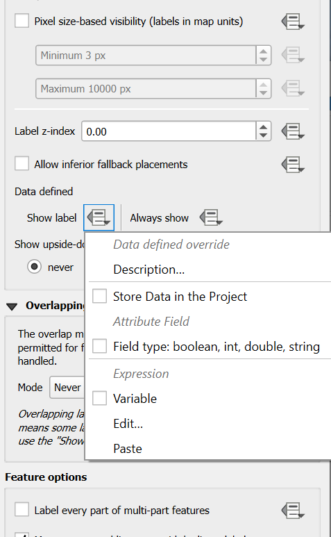
- In the
Expressionbox of the Expression String Builder window, enter:ROAD_TYPE like 'Major'. Click OK.
- In the
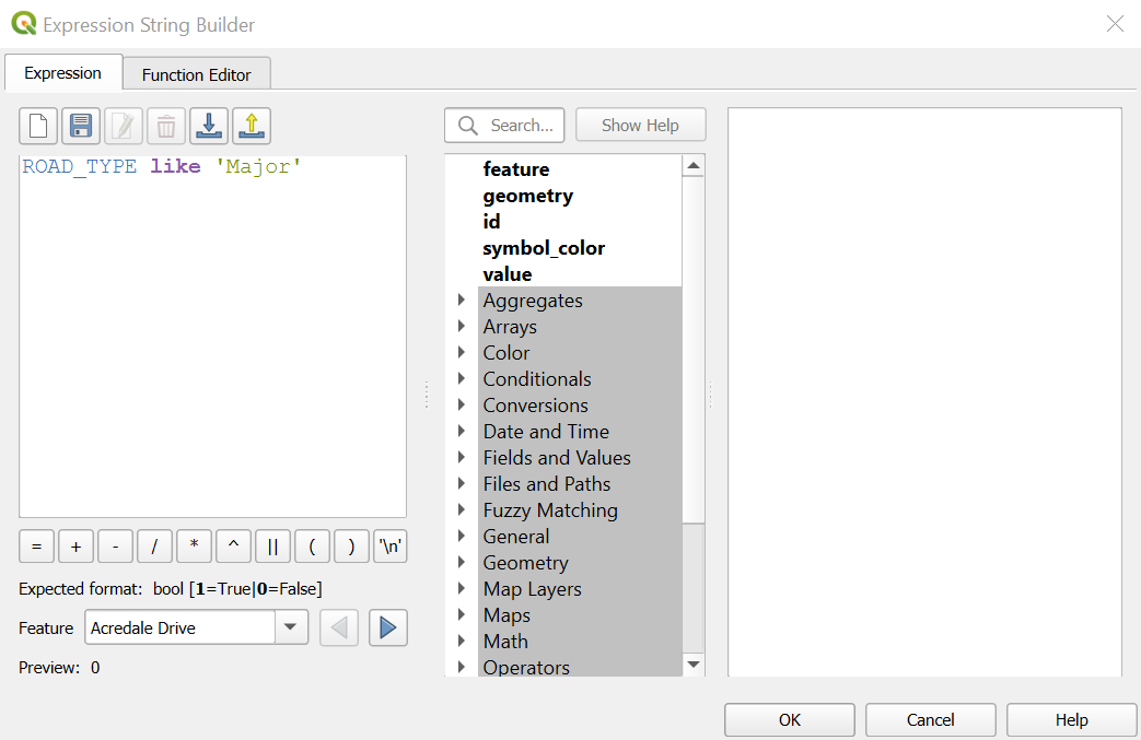
- Note that the labels are now only applied to major roads.
- Keep this setting, or remove it by re-clicking the dropdown and selecting
Clear.
- In the Rendering tab, go to the
Task 4: Find McMaster University
- Load the
Educational Institutionslayer (if you haven’t already) - In the Layers panel, right click the
Educational Institutionslayer and selectOpen Attribute Table. - In the attribute table, find
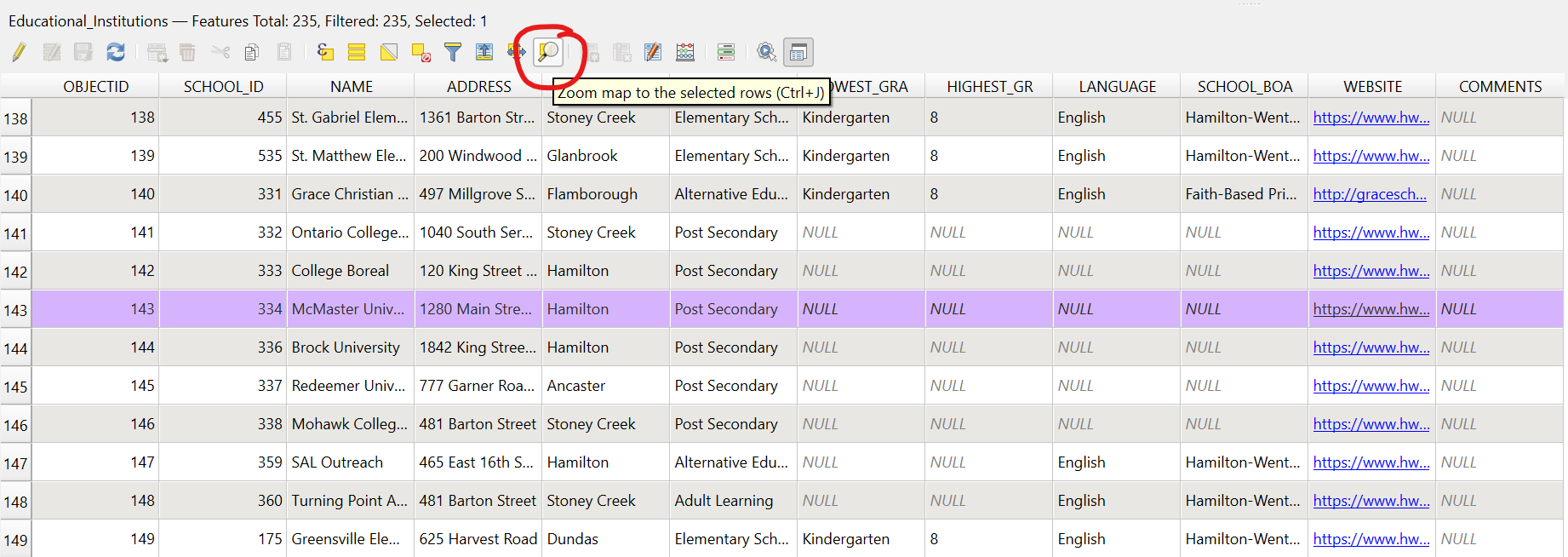
McMaster Universityin the NAME field (its Object ID is 143). - Click the row number (143) to highlight the row with McMaster University listed.
- On the attribute table toolbar, click “Zoom map to selected rows”, as shown below:
Task 5: Compose a map of the McMaster University Area
Objective: Create a map of the McMaster University area.
- Zoom the main data frame to the approximate desired extents for your map.
- Add all desired layers (Streets and Buildings should be added, at a minimum).
- Click on the New Print Layout button to open the map creation window.
- Give your map a name when the dialogue box comes up.
- In the map composer, add the critical elements of a map:
- Click the Add new map button and then draw a box to specify your map’s extent on the page. This will draw the contents of your data frame onto the map.
- Use the *Move Item Content button to change the extent and zoom. Click “Update Preview” in the “Main Properties” box to regenerate preview.
- With the map content selected, go to Item Properties and add a frame (if desired), a grid, or both.
- See this video for some examples of how to style the map.
Standard map elements
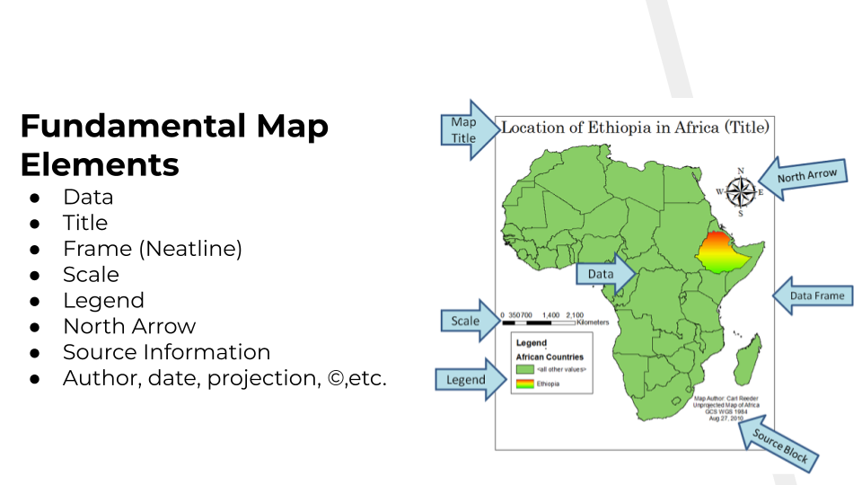
| Map Element | Description |
|---|---|
| Data | The core visual content and features of the map, representing the real-world information being conveyed. |
| Title | A clear, concise heading that tells the reader what the map is about, where it is located, and the time period it represents. |
| Frame/Neatline | A border that encapsulates the map elements, defining the map’s extent and keeping the layout organized. |
| Scale | A graphical, numerical, or textual relationship between distances on the map and the actual distances on the ground. |
| Legend | A key that explains the meaning of the symbols, colors, and patterns used throughout the map. |
| North Arrow | A directional indicator that orientats the map, often pointing toward true north. |
| Source Information | A citation that credits the origin of the data used to create the map for transparency and credibility. |
| Author, date, projection, ©, etc. | Metadata that indicates accountability and technical context, including who made the map, when it was created, how the Earth’s surface was flattened, and legal copyright ownership. |
Task 6: Annotate the map
- Use the Add New Labels button to add any desired labels (Use the
Item Propertiestab to control font size, colour, and background) - Use the Add North Arrow button to add a North arrow
- With the north arrow selected, scale it to the right size
- Go to
> Item Propertiesto select symbol different than the default.
- Use the Add Label button to add a title. Include the creator’s name and creation date
- Use the “Add legend” button to insert a legend, if desired.
- With the legend selected, click the “Item Properties” tab, rename and rearrange the legend items
- Use the Add Scale Bar tool to insert a scale bar
- Drag the bar to the desired location and size. Edit other details in the Items Properties box, if desired.
- Set units to Meters, and Label to “m” (if not already done for your map)
- Select the desired number of segments,
Task 7: Export the map to an image file
- In the map composer, use either the Export as image or Export as PDF buttons to export the map in the desired format to a desired directory.
Task 8: Save your project file
- Click the Save button to save your changes.
All done? Let’s move on to your second lesson, where we will map our newly-collected data!